Last Updated: 21 Nov 2025
If you’ve ever signed up for a newsletter, you already know the feeling. You hit that subscribe button, check your inbox, and there it is — the very first email from the brand you just trusted with your address.
That single email sets the tone. It can either make you think, “Wow, I’m glad I signed up,” or “Hmm… maybe this wasn’t worth it.”
That’s the power of a welcome email. It’s not just a polite hello — it’s the highest-impact message in your entire email marketing strategy.
Welcome emails often drive more more revenue than regular newsletters and consistently get 60% open rates (Source) than almost any other campaign. Why? Because you’re showing up in the inbox at the exact moment your subscriber is most engaged.
In this guide, we’re not only going to break down why welcome emails matter and how to create one that works, but we’ll also explore some of the 21 best welcome email examples out there.
We’ll look at what they do right, what you can learn from them, and how you can apply those lessons to your own email strategy.
If you’ve been treating your welcome email as an afterthought, you’re leaving money and trust on the table. Let’s change that starting today.
What Is a Welcome Email?
A welcome email is the very first message your subscriber gets after signing up to your list. Think of it as your digital handshake.
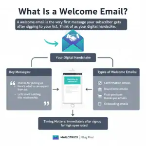
It’s your way of saying:
“Thanks for joining us.”
“Here’s what you can expect from us.”
“Let’s start building this relationship.”
The timing matters too. A welcome email usually lands immediately after someone subscribes — while your brand is still fresh in their mind. That’s why it often gets the 60+ open rates compared to any other email you’ll ever send.
There are different flavors of welcome emails, like:
Confirmation emails – making sure their signup worked.
Brand intro emails – sharing who you are and what you stand for.
First-purchase thank-you emails – sent right after someone buys.
Onboarding emails – guiding new users on what to do next.
What Things a Stunning Welcome email must have
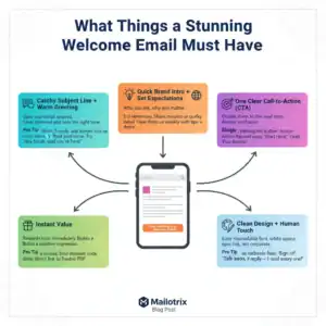
Catchy Subject Line + Warm Greeting
Your welcome email only works if they open it. Keep the subject line short and friendly, and use a warm, human greeting instead of a stiff “Dear Customer.”
Quick Brand Intro + Set Expectations
Share who you are in 2–3 simple sentences and tell them what kind of emails they’ll receive. This builds trust and prevents future unsubscribes.
One Clear CTA
Give them one clear next step—nothing more. A single button or link keeps the focus sharp and increases clicks.
Instant Value
Deliver something useful right away—a freebie, discount, or even a quick tip. Fast value builds a strong first impression.
Clean Design + Human Touch
Use a simple, readable layout and end with a personal sign-off. A small P.S. inviting replies makes the email feel human, not corporate.
Example 1: Grammarly’s Helpful Welcome Email
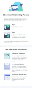
I really like Grammarly’s welcome email because it keeps things super simple. The moment you sign up, the email shows you how to install it and gives a quick example of what it can do for your writing.
No heavy design or long text — just clean, easy, and straight to the point.
What I Liked
What I liked in this email is how Grammarly makes everything about you. Instead of bragging about their tool, they show you the first quick win you can get. It almost feels like a mini tutorial sitting in your inbox.
What You Should Take From This Example
Make your welcome email simple and easy to understand.
Show new subscribers a quick win they can do immediately.
Focus on the reader, not just your product.
Keep the email clean and visually simple.
Example 2: Duolingo’s Fun Welcome Email
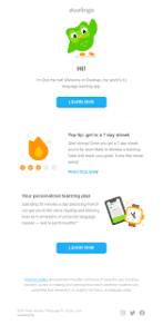
When you sign up for Duolingo, their welcome email feels like a little cheer for your language adventure. It’s colorful, full of their cute owl mascot, and shows you exactly where to start.
The big “Start Learning” button is there to get you going right away. It feels more like a friend saying, “Hey, let’s do this!” rather than a boring instruction sheet.
What I Liked
I loved how this email makes learning feel exciting instead of overwhelming. The characters and playful tone instantly put a smile on my face.
It doesn’t just tell you what to do—it makes you want to click and jump in. It’s fun, warm, and inviting.
What You Should Take From This Example
Keep your welcome email lively and personal—don’t make it dull.
Use visuals or little mascots to give your email personality.
Make the first step crystal clear with a bold CTA.
Make your subscribers feel excited and welcome from the very first line.
Example 3: Casper – The Cozy Welcome Email
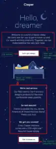
Casper, the mattress company, sends a welcome email that feels like a warm hug. It’s simple, clean, and instantly tells you what makes their brand special: comfy sleep and happy mornings.
They don’t throw too many products at you at once. Instead, they introduce their top picks and give you a clear way to start exploring. The email feels calm, cozy, and reassuring—exactly what you want when thinking about sleep.
What I Liked
I loved how Casper’s email doesn’t overwhelm you. It’s gentle and thoughtful, like they actually care about helping you sleep better.
The clean design and soft visuals make you feel relaxed, and the subtle CTA encourages action without being pushy.
What You Should Take From This Example
Keep your email simple and easy to read.
Focus on your subscriber’s feelings and experience, not just your products.
Use visuals that match the vibe of your brand.
Make your CTA inviting, not pushy.
Example 4: Glossier – The Friendly, Personal Welcome
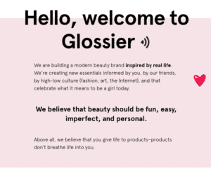
Glossier, the skincare and beauty brand, sends a welcome email that feels like a friend texting you. It starts with a warm greeting, thanks you for joining, and then gives a peek into their best products and community.
The email is bright, casual, and playful—exactly like their brand personality. It even includes tips for first-time users so you feel guided, not lost.
What Stands Out
The tone of this email is genuine and approachable. It doesn’t just push products; it shares a little story about the brand and invites you to explore at your own pace.
The use of clear visuals and short, friendly copy makes the whole experience enjoyable.
What You Should Take From This Example
Use a warm, conversational tone that feels personal.
Give new subscribers helpful tips, not just product links.
Let your brand personality shine through visuals and text.
Guide readers naturally toward exploring more without pressure.
Example 5: Dragon Alliance – The Adventure-Ready Welcome
Dragon Alliance, the eyewear brand, sends a welcome email that grabs your attention right away. It starts with a bold 10% discount and bright visuals of their snow goggles.
The email shows their top products in a segmented design, making it easy to explore different collections. Everything feels energetic and matches their adventurous brand vibe.

What I Learned
Here’s what really hits me: they don’t just throw a discount at you. The email is organized so you can focus on each product line without feeling lost.
The CTAs are clear and lead you exactly where you want to go. The punchy, lively copy matches their brand perfectly. Honestly, this kind of thoughtful design can really boost engagement because it feels personal, not like a generic sale email.
What You Should Take From This Example
Offer a clear, valuable reason for subscribers to click right away (like a discount).
Organize content so it’s easy to explore without being overwhelming.
Make CTAs obvious and purposeful.
Match your email tone to your brand personality—it helps readers connect.
Example 6: Huckberry – The Friendly Adventure Welcome
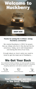
Huckberry, the outdoor lifestyle brand, sends a welcome email that feels like a friendly intro to a new adventure. It starts with a warm “Welcome to Huckberry” message and a big, eye-catching image.
The email shows their most popular and seasonal products, from jackets to outdoor gear, and even links to their journal for extra tips. The layout is clean and easy to follow, so you can check out everything without feeling lost.
What I Learned
What really stands out to me is how Huckberry makes you feel like part of their community. The email isn’t just trying to sell stuff—it tells their story and sparks curiosity.
The images are clear, the sections are easy to follow, and the buttons guide you without pushing too hard. This kind of email can really increase engagement because it feels personal and thoughtful, not spammy.
What You Should Take From This Example
Make your welcome email feel friendly and personal, not like a sales pitch.
Use images and sections to guide your readers naturally.
Highlight top products but also give extra value, like tips or stories.
Place buttons where it’s easy for readers to take action.
Make subscribers feel like they belong to your community.
Example 7: Spartan – The Motivational Welcome
Spartan, the fitness and obstacle race brand, sends a welcome email that pumps you up from the first line. It starts with a strong message: “Spartan is more than a race,” along with a bold, inspiring image.
The email talks about their values like discipline, teamwork, and dedication. There’s also a motivational quote from the founder, Joe De Sena. Clear buttons guide you to explore races, shop gear, or get inspired by their community.

What I Learned
What really hits me is how Spartan makes you feel like you’re part of something bigger. The email isn’t just about selling races or gear—it’s about sharing a mindset and inspiring action.
The visuals are strong, the copy is motivating, and the CTAs are clear. This kind of email can seriously boost engagement because it gives purpose, not just products.
What You Should Take From This Example
Start your email with a strong, inspiring message.
Share your brand values to connect emotionally with subscribers.
Use motivating visuals and quotes to create excitement.
Include clear CTAs that guide readers to explore more.
Make subscribers feel part of a bigger community or movement.
Example 8: Moosend – The Helpful Onboarding Welcome
Moosend, the email marketing platform, sends a welcome email that’s simple but super useful. It doesn’t try to impress with fancy designs; instead, it focuses on helping new users get started.
The email includes a short guide, a helpful GIF showing how to set up your account, and links to their Knowledge Base and Support Center. It’s clean, clear, and designed to make you feel ready to use their platform.

What I Learned
What I really like is how Moosend keeps things friendly and practical. The email doesn’t just tell you what to do—it shows you step by step. Using a GIF is clever because it demonstrates without needing long explanations.
The motivational CTA makes you want to click and start right away. Honestly, this approach can increase engagement because it’s helpful, not pushy.
What You Should Take From This Example
Keep your welcome email clear and easy to follow.
Show, don’t just tell—use visuals or GIFs to explain steps.
Provide helpful resources for beginners.
Write CTAs that motivate readers to take action.
Focus on guiding the subscriber, not just selling.
Example 9: Four Seasons – The Classy Welcome
Four Seasons, the luxury hotel brand, sends a welcome email that feels like receiving a personal invitation. It starts with a warm greeting from the Four Seasons President and includes beautiful images of their hotels and experiences.
The email shows their brand’s elegance and luxury, while also giving clear options to explore bookings, offers, and special perks. It’s polished, friendly, and makes you feel valued from the very first email.

What I Learned
Here’s what really caught my attention: this email isn’t just pretty—it makes you feel special. Using the subscriber’s name and a friendly tone immediately builds trust.
The visuals are high-quality and reflect the brand perfectly, while the CTAs guide readers without feeling pushy. Honestly, this kind of email can seriously increase engagement because it feels personal, elegant, and thoughtful.
What You Should Take From This Example
Make your welcome email feel personal—use names and warm language.
Match your email visuals and tone to your brand personality.
Include clear CTAs so readers know exactly what to do next.
Make subscribers feel valued and special.
Keep the design elegant, simple, and easy to navigate.
Example 10: Royalty Soaps – The VIP Welcome
Royalty Soaps sends a welcome email that makes you feel like a VIP from the very start. The email is friendly, visually pleasing, and shows off their products in a clean way.
They also promise not to spam your inbox, which makes the email feel trustworthy. The tone is playful but professional, giving the subscriber a sense of being part of something special.

What I Learned
What really hits me about this email is how it balances friendliness with trust. They don’t just throw products at you—they create a VIP experience.
The visuals are clear, the layout is clean, and the promise to not spam reassures readers. Honestly, this approach can make subscribers feel more connected to the brand and more likely to engage.
What You Should Take From This Example
Make subscribers feel special from the first email.
Use friendly, warm language that matches your brand.
Keep the layout clean and visuals attractive.
Build trust by including simple promises (like no spam).
Give readers a sense of being part of a community or VIP group.
Example 11: Velasca – The Commitment Campaign
Velasca’s welcome email makes new subscribers feel like they’re joining a family. The email combines a warm greeting with a special discount, which instantly grabs attention.
The brand also shares a short message from the founders, giving insight into their values and vision. They even include links to their Instagram to show products and build engagement. It feels personal, trustworthy, and motivating.

What I Learned
Here’s what I noticed: Velasca doesn’t just give a discount and hope people buy. They use the email to build a connection, explain their vision, and guide subscribers naturally to explore more.
The combination of friendly language, a clear offer, and social proof makes the email feel intentional and personal. This kind of approach can really improve click rates and customer loyalty.
What You Should Take From This Example
Make subscribers feel like they’re part of a community.
Combine a welcome offer with a personal brand message.
Share your values or vision to build trust.
Add social proof or links to social media for extra engagement.
Keep the email friendly but purposeful.
Example 12: Canva – Welcome Message with Tips
Canva’s welcome email is clean, simple, and easy to follow. It starts with a friendly greeting and quickly shows new users the perks of using the platform.

What I Learned
Here’s what hit me: Canva doesn’t just throw features at you—they guide you step by step. The email is visually simple but effective, and the bright CTA makes it obvious what to do next.
What You Should Take From This Example
Use a clear, simple layout that’s easy to read.
Give first-time users practical tips to get started.
Highlight your main action with a noticeable button or CTA.
Make the email feel helpful and friendly, not salesy.
Build confidence in new users by guiding them gently.
Example 13: MFMG Cosmetics – The Brand Introduction
MFMG Cosmetics sends a welcome email that shows who they are as a brand. The subject line even uses emojis to feel fun and friendly. Inside, the email introduces their products, shares social proof like logos of trusted companies,
and gives a small discount for first-time buyers. It feels personal, like the brand is saying, “Welcome! Here’s a little gift to get you started.”

What I Learned
What really stood out to me is how they mix personality with trust. They don’t just show products—they make you feel like you’re joining a community.
What You Should Take From This Example
Introduce your brand clearly and make it relatable.
Use social proof to build trust with new subscribers.
Give a small incentive, like a discount, to encourage the first action.
Make the email feel welcoming, not pushy.
Use fun, light touches like emojis to match your brand’s tone.
Example 14: Partake Foods – The Brand Story
Partake Foods sends a welcome email that tells the story of their brand while introducing their products. The email uses warm visuals of their cookies and snacks, and the founder’s personal message makes it feel heartfelt and real.
It’s a longer email than most, but it never feels boring because it combines storytelling with clear information about their products and perks for new subscribers.

What I Learned
What hit me is how they make the brand human. The founder’s message adds a personal touch, making the reader feel connected.
I noticed that the email isn’t just selling—it’s sharing a story, giving value, and gently leading you to explore their products. This shows that stories can be powerful in emails, making people care about your brand before they even buy.
What You Should Take From This Example
Use storytelling to make your brand feel real and relatable.
Include personal messages to connect with subscribers.
Combine brand story with visuals to keep the email engaging.
Highlight benefits or perks subtly, without pushing for a sale.
Make readers feel like they’re part of your brand journey.
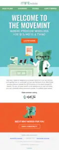
Example 15: Mint Mobile – The Join-the-Movement Email
Mint Mobile’s welcome email is fun, bold, and visually engaging. It shows their mascot and uses bright, contrasting colors that immediately grab attention.
The copy is short and clear, highlighting the value of joining Mint Mobile. Multiple CTAs guide new subscribers to explore plans, check out support, or learn more about the brand.
Overall, it feels like you’re joining a cool community rather than just signing up for a service.
What I Learned
What really stood out is how the email makes joining feel exciting. I learned that you don’t always need long text—short, punchy copy with strong visuals can do the trick.
The multiple CTAs are smart because they give options without making the email confusing. This approach can seriously increase engagement because it feels lively and purposeful, not boring or pushy.
What You Should Take From This Example
Make your welcome email visually engaging with bright, fun elements.
Use short, clear copy that communicates value immediately.
Include multiple, well-placed CTAs for different actions.
Make subscribers feel like they’re joining a community, not just a service.
Keep the tone lively and exciting to grab attention right away.
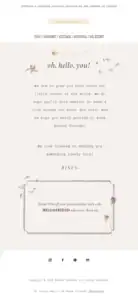
Example 16: Adored Vintage – The Jane Austen of Welcome Emails
Adored Vintage sends a welcome email with a vintage, elegant vibe. The design feels like a piece of parchment, and it includes a small discount. It’s short, themed, and fits the brand perfectly.
What I Learned
The email feels personal and stylish. I learned that matching the email design to your brand story can make it memorable. Small touches, like themed visuals and a discount, can really engage readers.
What You Should Take From This Example
Keep design aligned with your brand story.
Use small perks to grab attention.
Make the email feel personal and thoughtful.
Example 18: Besame Cosmetics – The Welcoming Gift
Besame Cosmetics sends a welcome email with a 10% off gift. The email shows some of their newest and popular products, with bright visuals that catch your eye. It’s short, sweet, and immediately makes you feel appreciated.

What Stands Out / What I Learned
I liked how they give a small gift right away. It makes subscribers feel special and encourages them to explore the products. I learned that offering something simple, like a discount, can boost clicks and first purchases.
What You Should Take From This Example
Offer a small gift or discount to welcome new subscribers.
Keep the email short and visually appealing.
Highlight products without overwhelming the reader.
Example 19: Manitobah – The Segmented Welcome Email
Manitobah, a winter boot brand, sends a welcome email that’s neatly divided into sections. They introduce their brand, show product highlights, and end with an exclusive discount.
Emojis and warm text make it feel friendly, while each section focuses on one thing so it’s easy to read.

What I Learned
I liked how the email is split into clear sections. You don’t feel overwhelmed, and it’s easy to see what’s important. I learned that breaking information into chunks helps guide readers through the email without confusing them.
What You Should Take From This Example
Use sections to organize information.
Make the first email feel friendly and personal.
Add a small discount or offer to encourage clicks.
Keep visuals and text balanced so it’s easy to follow.
Example 20: Hiut Denim – The Unique Welcome
Hiut Denim sends a welcome email that feels different from most brands. It starts with a playful image and a personal message from the co-founder, David Hieatt.
They even include a free digital manual to inspire new subscribers. The email stands out because it feels like it’s coming from a person, not a company.

What I Learned
I liked how personal this email feels. It doesn’t just sell jeans; it shares a story and gives something valuable right away. I learned that adding a personal touch and offering helpful content can make subscribers feel connected and curious.
What You Should Take From This Example
Make your email feel personal and human.
Share a small gift or useful content to engage readers.
Tell a story to connect with your audience.
Stand out by doing something different than typical welcome emails.
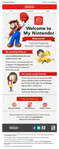
Example 21: Nintendo – Brand Identity in Email
Nintendo sends a welcome email that instantly feels like Nintendo. The email uses bright colors, fun icons, and characters like Mario to make the moment exciting.
It’s playful, lively, and matches the joy you expect from the brand. New subscribers immediately know what the brand is about and what kind of fun content they’ll get.
What Stands Out / What I Learned
Here’s what really hits me about this email: Nintendo doesn’t just say “Welcome”—they show who they are through visuals and tone. The colors, characters, and playful text make the email instantly recognizable.
It feels like stepping into the Nintendo world rather than a generic welcome. Using brand identity this way can make your emails unforgettable and build loyalty from the first message.
What You Should Take From This Example
Make your brand instantly recognizable in your welcome email.
Use visuals, colors, and tone that match your brand personality.
Let the email reflect your brand’s fun or unique vibe.
Make subscribers feel they’re entering a special world, not just reading a message.
Best Practices for Writing Welcome Emails (Detailed)
1. Send Your Welcome Email Right Away
One study found that a welcome email sent immediately has 88.3% more opens and 29.3% more clicks than emails sent at a later time. (Source)
If you wait too long to send your welcome email, that excitement fades, and they may forget why they signed up in the first place.
The best way to take advantage of this excitement is to send your welcome email instantly. This makes your new subscribers feel noticed and valued from the very beginning.
Here’s how you can make it work:
Use an automated email system so the email goes out as soon as someone signs up.
Make the subject line clear and friendly, letting them know you’re happy they joined.
Keep the email short and simple, showing them what they can do next or what to expect from your emails.
Sending your welcome email immediately increases the chance it will be opened, read, and acted upon, helping you start a strong relationship with your subscribers.
2. Write a Subject Line That Grabs Attention
Research shows that Nearly half of all email recipients—47%—decide whether to open an email based on the subject line alone. (Source)
That means if your subject line doesn’t stand out, your subscribers might never even look at the email content you worked hard on.
The subject line is like the front door to your email—it decides whether people walk in or just pass by. A good subject line sparks curiosity, promises value, or feels personal enough to make someone click.
Here’s how you can nail it:
Keep it short and simple so it shows clearly on mobile screens.
Mention the benefit upfront (like “Get 15% Off Your First Order” or “3 Tips to Start Writing Better Today”).
Add a personal touch when possible (“Welcome to the family, [Name]”).
Avoid spammy words like “FREE!!!” which might land your email in the junk folder.
A catchy subject line can mean the difference between your email being ignored or being the start of a long and profitable relationship with your new subscriber.
3. Make Your Email Feel Personal
One study found that personalized emails achieved a 29% higher open rate and a 41% higher click-through rate compared to non-personalized emails. (Source)
The reason is simple—people like feeling seen and valued. A welcome email that feels personal can build trust right from the start.
Personalization doesn’t just mean adding someone’s first name in the subject line. It’s about making the reader feel like you’re talking directly to them. You can mention why they signed up, suggest products or content based on their interests, or simply say “we’re glad you’re here.”
Here’s how you can do it:
Use their name in the subject line or greeting—it instantly feels warmer.
Segment your audience so people only get content that matches their needs.
Write in a conversational tone, as if you’re talking to a friend instead of a faceless customer.
When your subscribers feel like you understand them, they’re more likely to read your emails, trust your brand, and stick around longer.
4. Show Them What to Do Next
Research shows that welcome emails with a clear call-to-action (CTA) has 371% increase in clicks and a 1,617% rise than those without one. (Source) Why? Because people like being guided. If you don’t tell your new subscriber what to do next, they may leave without taking any action.
A good CTA doesn’t confuse or overwhelm. It points your reader to one simple next step—whether that’s checking out your best products, reading a starter guide, or joining your community. The clearer the path, the more likely people are to follow it.
Here’s how you can guide them:
Use one main CTA instead of cluttering your email with too many buttons.
Make your CTA button stand out with a strong action phrase like “Start Learning” or “Shop Now.”
Place the CTA in a visible spot so it’s easy to find without scrolling too much.
When readers know exactly what to do next, they’re more likely to click, explore, and eventually become loyal customers.
5. Keep It Short and Easy to Read
Research shows that people spend only about 10 seconds reading a brand email (Source). That means if your welcome email is too long or stuffed with information, most readers won’t finish it. A short and clear email keeps your audience engaged and makes your message easier to remember.
The goal of a welcome email is not to tell your entire brand story in one go. It’s to give a warm introduction and lead your readers to the next step. Think of it like a handshake—you don’t need to say everything at once, just enough to make a good first impression.
Here’s how you can do it:
Use short sentences and simple words—avoid jargon or long paragraphs.
Break your content into small chunks with clear headings or bullet points.
Stick to one main idea instead of trying to cover everything in one email.
When your email is easy to read, subscribers are more likely to finish it, remember it, and actually take action on your message.
6. Match Your Brand’s Voice and Style
Research shows that consistent branding across all channels can increase revenue by up to 23%. Your welcome email is often the very first direct message a subscriber gets from you, so it’s the perfect place to show off your brand’s personality.
If your email feels too formal when your brand is fun and casual (or vice versa), it can confuse new subscribers. Instead, your tone, colors, and design should all feel like “you.” This makes your emails recognizable and helps build trust faster.
Here’s how you can do it:
Use colors, fonts, and visuals that match your website and social media.
Write in the same voice your brand uses everywhere else (friendly, professional, playful—whatever fits).
Share a small story, value, or detail that makes your brand feel human and relatable.
When your welcome email feels like a natural extension of your brand, readers will instantly know what you stand for and be more likely to stick with you long-term.
7. Offer Value Right Away
Research shows that subscribers who get something valuable in the very first email are much more likely to stay engaged over time. (Source) If your welcome email only talks about your brand without giving the reader a reason to care, they may lose interest quickly.
Value can come in many forms—it could be a discount, a free guide, a helpful tip, or even just clear direction on how to get started. The key is to give your subscriber something useful right away so they feel glad they signed up.
Here’s how you can do it:
If you promised a discount or freebie, deliver it in the welcome email itself.
Share a quick, actionable tip your readers can try immediately.
Point them to your most useful resources like blogs, videos, or product guides.
When people see value from the start, they’re more likely to open your next email, trust your brand, and even make a purchase sooner.
8. Use a Clear Call-to-Action (CTA)
One of the biggest mistakes people make in welcome emails is stuffing too many links or not giving readers any direction at all. Research shows that emails with a single, clear CTA get much higher click rates compared to emails that try to do everything at once. If your reader doesn’t know what step to take, chances are they won’t take any.
Here’s how you can apply this:
Decide on one main action you want subscribers to take (shop now, start a course, download a freebie, etc.).
Make your CTA button stand out with bold colors and clear wording like “Get Started” or “Shop Now.”
Place the CTA above the fold (so readers see it without scrolling) and repeat it once more at the bottom for people who read the whole email.
A strong CTA gives your welcome email purpose. Instead of just reading and closing it, your subscriber actually takes the next step toward engaging with your brand.
9. Keep Your Design Clean and Easy to Read
Here’s the thing: a messy email layout can kill engagement. If your welcome email looks cluttered or hard to read, most people will close it without even noticing your message. Research shows that simple, scannable designs improve click-through rates because readers can quickly find what they care about.
Here’s how I approach this:
Stick to one or two fonts and keep them big enough to read easily on both desktop and mobile.
Use plenty of white space so the email feels open, not crowded.
Add visuals that support your message but don’t overload the email with too many images.
Make sure your email is mobile-friendly—over 60% of emails are opened on phones, so test it on different screens.
When your design is clean, your message shines. Readers will actually focus on what you’re saying instead of fighting through a wall of text or confusing layout.
10. Test and Optimize Your Welcome Emails
Here’s the thing: you can’t just send a welcome email once and expect it to always work perfectly. What works for one audience might not work for another. Testing different elements in your emails helps you see what actually makes people open, click, and engage.
Here’s how I approach this:
Try different subject lines to see which grabs attention best.
Test your CTA buttons—text, color, and placement can all make a difference.
Experiment with images or GIFs to see which visuals get more engagement.
Send A/B versions of your email to a small group first before sending it to everyone.
When you test and optimize, you learn what your audience likes. Over time, your welcome emails will perform better, get more clicks, and keep your subscribers interested.
11. Personalize Your Emails
Here’s the thing: people love when an email feels like it was made just for them. Generic emails don’t get much attention, but personalized emails can make your subscribers feel special and increase engagement.
Here’s how I approach this:
Start with the subscriber’s name in the greeting. It instantly feels more personal.
Segment your audience based on their interests, location, or behavior so they receive content that matters to them.
Use dynamic content blocks to show different offers or products depending on who’s reading.
Refer to past interactions if possible, like “Thanks for signing up at our summer sale!”
When your email feels personal, subscribers are more likely to open it, click through, and stay engaged. Personalization can turn a simple welcome email into the start of a real connection.
Welcome Emails Templates
1. Welcome Emails Templates for Brands
Subject line: “Welcome to [Brand Name] – Here’s a Special Treat 🎁”
Email body:
Hi [First Name],
We’re thrilled to have you join the [Brand Name] family! 🎉
As a thank you, here’s [special offer, discount, or freebie] just for you.
Why you’ll love us:
[Benefit 1]
[Benefit 2]
[Benefit 3]
👉 Claim your [offer/freebie] now [CTA Button]
Thanks for joining us,
The [Brand Name] Team
Tip: Keep the design clean, brand colors, and the CTA prominent.
2. Welcome Emails Templates for E-commerce
Subject line: “You’re In! Here’s 10% Off Your First Order 🛒”
Email body:
Hi [First Name],
Welcome to [Store Name]! We’re excited to help you find your next favorite [product category].
As a welcome gift, enjoy 10% off your first purchase. Just use code: WELCOME10 at checkout.
Top Picks for You:
[Product 1]
[Product 2]
[Product 3]
Don’t wait too long—your discount expires in 7 days!
👉 Shop Now [CTA Button]
Happy shopping,
[Store Name] Team
Tip: Showcase a few products with images to boost clicks.
3. Welcome Emails Templates for Blog
Subject line: “Welcome to [Blog Name] – Let’s Start Your Journey!”
Email body:
Hi [First Name],
Thanks for joining the [Blog Name] community! You’re now part of a group that loves [topic/niche].
Here’s where to start:
Popular Post #1 – [Link]
Popular Post #2 – [Link]
Popular Post #3 – [Link]
We’ll send you tips, guides, and insights straight to your inbox.
👉 Read Our Top Posts [CTA Button]
Excited to share this journey with you,
[Your Name]
Tip: Include 2-3 internal links to high-value posts to boost engagement.
4. Welcome Emails Templates for Newsletter
Subject line: “Welcome! Here’s What to Expect from Our Newsletter ✨”
Email body:
Hi [First Name],
Welcome to the [Newsletter Name]! You’ve just joined [X] readers who get the best [industry/topic] insights delivered weekly.
Here’s what you can expect:
Exclusive tips & strategies
Curated resources and tools
Early access to [product/events/updates]
Want to get started now? Check out our most popular guide: [Link]
Thanks for joining,
[Your Name / Team Name]
Tip: Keep it short, value-packed, and make your first link super clickable.
Conclusion
Welcome emails are more than just a “hello.” They are your first chance to make a strong impression, build trust, and guide your new subscribers toward taking action.
By personalizing your message, offering value, using clear CTAs, and keeping your design clean, you can turn a simple welcome email into a powerful tool for engagement and sales.
Remember, every detail counts—from the subject line to the visuals to the tone of your copy. Test your emails, see what works, and keep improving.
A well-crafted welcome email doesn’t just get opened—it starts a relationship that can grow into long-term loyalty and real results for your business.
View more Email marketing stuff

