Last Updated: 17 Jun 2026
I didn’t grow my email list because I was getting more traffic.
I grew it because I finally fixed my email opt-in forms.
That lesson cost me months of frustration.
I’ve tested different opt-in forms, made countless mistakes, and run more experiments than I can remember on my own websites.
Some changes increased signups almost overnight.
Others hurt conversions and taught me what not to do.
This guide is everything I wish someone had taught me when I started.
The opt-in forms that work.
The ones that don’t.
And the lessons that helped me turn more readers into subscribers.
What an Email Opt-In Form Actually Is
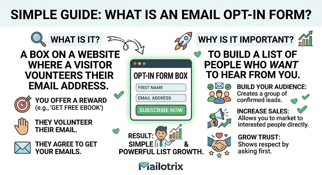
An opt-in form is a form on your website or landing page where someone enters their email address to join your email list.
That is the simple version.
Here is the fuller version:
An opt-in form is the moment where a visitor decides whether you have earned their email address.
They land on your page. They read your content. They see your form. In two seconds — sometimes less — they make a decision. Is this worth my inbox?
Most of the time the answer is no. Not because the visitor does not care about the topic. Because the form did not make a strong enough case for yes.
That gap — between the visitor who might subscribe and the visitor who actually does — is where opt-in form optimization lives.
Every improvement you make to your forms closes that gap a little more. And because your forms are always running — even while you sleep — small improvements compound into thousands more subscribers over time.
Why Most Opt-In Forms Fail Before Anyone Fills Them In
Most opt-in forms ask for something before they offer something.
They lead with the ask. “Subscribe to my newsletter.” “Join my list.” “Sign up for updates.”
The visitor reads this and thinks: why should I?
There is no answer. The form just asked. No promise. No reason. No clear value in exchange for the email address.
The visitor moves on.
This is the most common reason opt-in forms fail. Not bad design. Not wrong placement. No clear answer to the question every visitor is silently asking:
What is in this for me?
When your form answers that question — clearly and specifically — people subscribe.
When it does not — they scroll past.
Everything else in this guide builds on that one idea.
The 6 Types of Opt-In Forms (And When to Use Each One)
There are six main types of opt-in forms. Each one works in different situations. Using the right type for the right moment is one of the fastest ways to improve your conversion rates.
Type 1: The Pop-Up
A pop-up is a form that appears over the content of your page. The visitor is reading. The form slides in, fades in, or appears in the center of the screen.
Pop-ups get a bad reputation because they are so often used badly – appearing too early, too aggressively, on every page, with no relevance to what the visitor is doing.
Used well – pop-ups are the highest-converting form type available.
The key is matching when and where the pop-up appears to the visitor’s state of mind. A pop-up that appears five seconds after someone lands on your homepage is annoying.
A pop-up that appears when someone has read 70% of a specific blog post — after they have already decided they like your content – converts very well.
Type 2: The Inline Form
An inline form sits inside the content of a page. It is embedded in a blog post, between sections of an article, or at the end of a piece of content.
Inline forms feel less intrusive than pop-ups. The visitor encounters them while reading — which means they have already shown interest by reading that far.
Conversion rates for inline forms are lower than pop-ups — typically 1 to 5% — but the subscribers they attract have higher intent because they stopped to fill out the form mid-content.
Type 3: The Landing Page
A landing page is a full page built specifically to get visitors to subscribe. No navigation. No links to other pages. Just the offer and the form.
Landing pages convert at the highest rates of any opt-in format — often 20 to 40% when matched to the right traffic. That is because they have no distractions. The visitor came specifically to decide whether to subscribe. Nothing pulls them away.
Landing pages are what you link to from social media, podcast appearances, paid ads, and anywhere outside your website.
Type 4: The Slide-In
A slide-in form slides in from the bottom corner of the page — usually after the visitor has scrolled down a certain amount. Less intrusive than a full pop-up. More visible than a sidebar form.
Slide-ins convert at moderate rates — better than sidebars, lower than pop-ups. They work best on long-form content where the visitor is clearly engaged and scrolling through the full article.
Type 5: The Hello Bar (Top Bar)
A thin bar that runs across the very top of your website. Always visible. Always in view. Low friction — it does not interrupt what the visitor is doing.
Conversion rates for top bars are low — usually under 1%. But they run constantly. On every page. For every visitor. Over time, the volume adds up.
Top bars work best as a secondary form — not your primary opt-in tool, but a passive presence that catches visitors who would not have been caught by a pop-up.
Type 6: The Exit Intent Pop-Up
A form that appears when the visitor moves their cursor toward the browser tab — signaling they are about to leave.
Exit intent pop-ups are the least annoying form of pop-up because they only appear when the visitor has already decided to go. They have nothing to lose. If the form offers something compelling enough — a percentage of them stay and subscribe.
Conversion rates for exit intent pop-ups run between 2 and 8%. Low compared to well-timed scroll pop-ups, but they catch visitors you would otherwise lose entirely.
The Form Friction Stack – What Kills Conversions Without You Noticing
This is a framework I use to diagnose why an opt-in form is underperforming.
I call it the Form Friction Stack.
Every opt-in form has a stack of friction elements. Each one adds a small amount of resistance to the decision to subscribe. Add enough small resistances together — and the visitor decides it is not worth it.
The goal is not to get to zero friction. Some friction is unavoidable. The goal is to remove every piece of friction that is not doing something useful.
Here are the most common friction elements and what to do about each one.
Friction 1: Too many form fields
Every additional form field reduces your conversion rate. This has been tested and confirmed so many times that it is not a theory anymore. It is a fact.
First name plus email converts better than last name plus first name plus email plus phone number.
Email only converts better than first name plus email — sometimes significantly.
The instinct to collect more information upfront is understandable. But every additional question you ask is a reason for the visitor to reconsider.
Collect only what you need to send the first email. You can collect more information later — through surveys, reply behavior, and segment tags — once the subscriber trusts you.
Friction 2: Vague value proposition
“Subscribe to my newsletter for tips and updates” is not a value proposition. It is a description of the mechanics of subscribing.
A value proposition tells the visitor what changes for them after they subscribe. What specific thing will they know, have, or be able to do?
“Get one actionable email marketing tip every Tuesday — specific enough to use in your next campaign.”
That is a value proposition. It is specific. It makes a promise. It gives the visitor a reason to say yes.
Friction 3: A button that says Submit
“Submit” is the most common and worst button copy on the internet.
It says nothing about what happens when you click it. It sounds like a form you fill out for a tax return. It creates zero excitement about what is on the other side.
Button copy should describe the action and the outcome. “Send Me the Checklist.” “Join the Newsletter.” “Get My Free Templates.” “Start Learning.” Any of these beats “Submit” by a measurable margin.
Friction 4: No privacy note
In 2026, people are protective of their email addresses. They know that giving it out can mean spam, being sold to third parties, or being added to lists they did not ask for.
A single short line under the form field removes this concern.
“No spam. No sharing your information. Unsubscribe anytime.”
One line. Takes ten seconds to add. Reduces the concern that signing up is a mistake.
Friction 5: A design that looks untrustworthy
A form that looks like it was built in 2009 — mismatched fonts, inconsistent colors, broken layout on mobile — makes the visitor hesitate.
Design builds trust before a single word is read. A clean, professional-looking form signals: this person takes their work seriously. A messy, outdated form signals the opposite.
You do not need to be a designer. Every major email tool has form templates that look professional out of the box. Use them.
Friction 6: Appearing at the wrong moment
A pop-up that fires two seconds after someone lands on your homepage is friction before the visitor has had any reason to trust you. They did not choose to be here long enough to want more from you.
A pop-up that fires after someone has read 60% of a relevant article is well-timed. They have already decided they like your content. The form is a natural next step.
Timing is everything. The right form at the wrong moment fails. The same form at the right moment converts.
Where to Put Your Opt-In Forms – Placement Changes Everything
Where your form lives determines who sees it and at what point in their visit.
Different placements attract subscribers with different levels of intent. Understanding that lets you build a form strategy instead of just placing forms randomly.
Homepage
Your homepage gets broad traffic. People who found your site through social media, referrals, and brand searches. They may or may not know what your newsletter is about yet.
On the homepage — your form needs to work harder. It needs to explain the value clearly because the visitor does not have the context that comes from reading one of your blog posts. A dedicated above-the-fold opt-in section – or a well-timed pop-up triggered after 30 to 60 seconds — works best here.
Inside blog posts
People reading your blog posts are already engaged. They clicked on a post. They are reading it. They have shown interest.
Inline forms placed inside blog posts — especially after the first few paragraphs and near the end — convert well because the visitor has context. They have read enough to know whether your content is useful.
Content upgrades — a bonus resource specifically related to the post the visitor is reading — convert even better. Because the offer is matched perfectly to what they are already reading.
At the end of posts
Someone who reads all the way to the end of a blog post is a highly motivated visitor. They stayed. They read everything. That is a strong signal.
An opt-in form at the very end of a post catches these high-intent visitors at the moment of peak engagement. It should not be generic. It should connect to what they just read.
On a dedicated landing page
This is where you send people from outside your website — social media profiles, podcast mentions, email signatures, paid ads.
Your landing page should have nothing except the form and the offer. No navigation. No links. No distractions. The singular focus produces conversion rates that no embedded form can match.
In the navigation bar
A “Subscribe” link in your site navigation is a low-friction passive option. It does not interrupt. It does not push. It just sits there for the visitors who are ready to find it.
Conversion rates are low – but it catches a small percentage of visitors who were looking for it and would have been annoyed by a pop-up.
The 5 Elements Every Opt-In Form Needs
Every opt-in form — regardless of type, placement, or design — needs these five things.
Element 1: A headline that makes a promise
The headline is the most important copy on the form. It is almost always the first thing the visitor reads.
It should state a specific outcome. Not “Subscribe to my newsletter.” Not “Join our community.” What changes for the visitor after they subscribe?
“Get one actionable email marketing strategy every week — specific enough to use in your next campaign.”
“Learn how to build your first 1,000 subscribers without running a single ad.”
“A weekly email for bloggers who want to turn their list into real income.”
The promise should be honest and specific. Vague promises create low expectations and low conversion rates.
Element 2: One to two sentences of supporting copy
Below the headline – one or two sentences that add specificity or remove doubt.
Not a paragraph. Not a list of benefits. One or two sentences that answer the next question the visitor is asking after reading the headline.
“Every Tuesday. One tactic. Five minutes to read. Yours free.”
“Join 4,200 bloggers and creators who read this every week.”
“No spam. No sales pitches. Just one useful thing, every week.”
Short. Specific. Adds something the headline did not already say.
Element 3: The form field (email only)
Ask for email address only unless you have a specific reason to ask for more.
First name is acceptable if you want to personalize your emails. But every field beyond email address adds friction. Be honest with yourself about whether the data you collect from additional fields is worth the subscribers you lose by asking for it.
Element 4: Button copy that says what happens next
Not “Submit.” Not “Sign Up.” Not “Click Here.”
The button copy should describe the action and the outcome in a way that feels like a small step forward, not a commitment to something unknown.
“Send Me the Weekly Email” “Get the Free Checklist” “Join the Newsletter” “Start Learning” “Yes — I Want This”
The button is the last thing the visitor reads before deciding. Make it as easy as possible to say yes.
Element 5: A privacy line
One sentence. Under the button. In small text.
“No spam. Unsubscribe anytime.”
That is enough. It removes the last hesitation for visitors who want to subscribe but are worried about what comes after.
Headlines – The Sentence That Decides Everything
The headline on your opt-in form is doing one job: making the visitor want to keep reading.
If the headline does not work — nothing else matters. The visitor is gone before they reach the button.
Most opt-in form headlines fail because they describe instead of promise.
“Email Marketing Newsletter” – describes what the thing is. “Get better at email marketing” – describes a vague benefit. “The weekly email that helps bloggers build lists that actually earn money” — promises a specific outcome for a specific person.
The third one converts better. Every time.
The headline formula that works
[What they get] + [Who it is for] + [The specific result]
You do not always need all three. But the more of them you include — the more specific the promise becomes. And specific promises convert better than vague ones.
Real examples:
“The weekly email for creators who want to turn their newsletter into income.” (Who it is for + result)
“One email every Tuesday. One tactic you can use the same day.” (What they get + implied result)
“Stop losing subscribers after the welcome email — the free checklist is inside.” (Problem + solution)
Write five headline options before you pick one. The first one is rarely the best one.
The Copy Below the Headline – What to Say and What to Skip
Most opt-in forms include too much copy below the headline.
A bullet list of seven reasons to subscribe. Three paragraphs about the newsletter. Testimonials. A bio of the writer.
The visitor does not read most of this. They scan the headline, glance at the button, and make a decision.
Less is more here.
The copy below the headline should do one of two things.
Add one specific detail the headline left out. “Every Tuesday. Free. No spam.”
Or remove one doubt the visitor might have. “Join 3,800 subscribers who read this every week.” “Unsubscribe anytime – one click.”
That is it. One thing. Not seven things. The visitor is not going to read a sales page for a free newsletter. They are going to read one sentence and decide.
Make that one sentence count.
Form Fields – How Many Is Too Many
The data on this is clear and has been confirmed across hundreds of studies:
Every form field you add reduces your conversion rate.
Not by a small amount. By a meaningful amount.
Going from two fields (name + email) to one field (email only) typically increases conversion rates by 25 to 50%.
Going from four fields to two fields can double conversion rates.
The reason is simple. Every field is a question. Every question is a reason to pause. Every pause is a moment where the visitor might decide the effort is not worth it.
Here is how to decide how many fields to use:
Ask only for information you will actually use in the first email.
If you personalize emails with first name — ask for first name. If you do not — do not ask for it.
If you segment by location and send location-specific content — ask for location. If you do not — do not ask for it.
If you need nothing but the email address to send your first email — ask for nothing but the email address.
You can always collect more information later. A survey sent to new subscribers. A reply to the welcome email. A quiz in the third email of your sequence. All of these collect data without putting it as a barrier on the opt-in form itself.
Button Copy – The Most Underrated Part of Any Form
Most people spend twenty minutes writing their headline and two seconds writing their button copy.
Then they write “Subscribe.”
Here is the thing about button copy. It is the last word the visitor reads before making the decision. It either gives them a clear, easy reason to click — or it does not.
“Subscribe” does not give them a reason. It describes the action. It does not describe the outcome.
The button copy that converts best in 2026:
It is specific about what happens when you click. “Send Me the Free Templates” is better than “Subscribe.”
It uses “me” or “my” language. “Get My Free Checklist” converts better than “Get the Free Checklist.” The small shift from “the” to “my” makes the click feel personal and active.
It sounds like the beginning of something good — not a commitment to something unknown.
Real examples that work:
“Send Me the Weekly Email” “Yes — I Want the Checklist” “Get My Free Welcome Email Templates” “Join the Newsletter” “Start Reading for Free”
Real examples that do not work:
“Submit” “Sign Up” “Click Here” “Subscribe Now”
Change your button copy. It takes sixty seconds. The conversion lift is real.
Social Proof – The Element Most Beginners Skip
Social proof is evidence that other people have already said yes.
It reduces the risk of the decision. If 4,000 people have already subscribed — the visitor thinks: these people decided it was worth it. Maybe it is worth it for me too.
The most common forms of social proof on opt-in forms:
Subscriber count
“Join 4,200 subscribers” or “Read by 12,000 email marketers every week.”
This works when the number is large enough to feel meaningful. If you have 87 subscribers — do not put that number on the form. It signals a young, unproven newsletter. Wait until you have at least a few hundred before adding a subscriber count.
Testimonials
A short quote from a real subscriber about what they got from the newsletter.
“This is the only newsletter I open the same day it arrives.” — Sarah M., Food Blogger
One testimonial is enough. Two is fine. More starts to feel like a sales page.
The testimonial must be specific. “Great newsletter!” is not social proof. “This is the only email marketing content I have found that is honest about what actually works vs what sounds good in theory” is specific enough to be believable.
Logos or publications
If your content has been featured in or referenced by well-known publications — a simple “As seen in” with logos adds instant credibility.
This is only worth including if the publications are genuinely recognizable to your audience. Obscure blogs do not count. Major industry publications, national media, or well-known community platforms do.
Pop-Up Timing – When to Show Your Form and When to Wait
Pop-up timing is one of the most important and most ignored parts of opt-in form strategy.
The exact same pop-up can convert at 1% or at 8% depending entirely on when it appears.
Here are the triggers that work in 2026 and when to use each one.
Time delay
The pop-up fires after the visitor has been on the page for a set number of seconds.
Two seconds: too early. The visitor has not read anything yet. They have no reason to trust you. The pop-up feels aggressive.
Thirty seconds: better. The visitor has had time to start reading.
Sixty seconds: good for short pages. The visitor has been engaged long enough to form an opinion.
The right time delay depends on how long it takes to read enough of your page to form an opinion about whether you are worth subscribing to. For most blog posts — 45 to 90 seconds.
Scroll depth
The pop-up fires when the visitor scrolls past a certain percentage of the page.
This is better than time delay because it is based on engagement rather than time. A visitor who scrolls to 60% of a blog post has read enough to decide whether the content is useful.
Trigger your pop-up at 50 to 70% scroll depth for blog content. It appears at the moment of highest engagement.
Exit intent
The pop-up fires when the visitor moves their cursor toward the browser tab — signaling they are about to leave.
This is the least intrusive pop-up trigger. It only fires for visitors who were already leaving. It does not interrupt the reading experience.
Use exit intent pop-ups as a last-chance offer. A stronger incentive — a lead magnet, an exclusive resource — works better here than a generic newsletter signup.
Page-specific triggers
Show different pop-ups on different pages based on the content of those pages.
A visitor reading a blog post about welcome emails should see a pop-up offering a welcome email template — not a generic newsletter signup.
This is called content-matched pop-ups. They convert at dramatically higher rates than generic pop-ups because the offer is perfectly relevant to what the visitor just read.
Most email tools allow you to set different pop-ups for different pages. Use this feature.
Double Opt-In – What It Means and Whether You Need It
Double opt-in means a subscriber submits your form — and then receives a confirmation email asking them to click a link before they are fully added to your list.
Single opt-in means they submit the form and are immediately added.
The case for double opt-in
It produces higher-quality subscribers. Someone who confirms their email address twice has demonstrated intent. Accidental signups, fake addresses, and mistyped emails never make it through.
It improves deliverability. Your list has fewer invalid addresses, fewer bounces, and a cleaner engagement record.
It protects you from spam complaints from people who did not intend to subscribe.
The case for single opt-in
You lose 20 to 30% of subscribers who submit the form but never confirm. Some of those are genuinely interested people who missed the confirmation email or did not understand they needed to take a second step.
Single opt-in produces more subscribers from the same amount of traffic.
What to actually do
Use double opt-in if deliverability and list quality are your top priority. Especially for B2B audiences, high-value niches, and lists you plan to monetize through sales.
Use single opt-in if growth speed matters more to you right now and you are willing to clean your list more aggressively over time.
If you use double opt-in — tell subscribers before they submit the form. “Check your inbox for a quick confirmation email — click the link and your resource is on the way.” This one sentence significantly increases confirmation rates by setting the expectation before the surprise.
Mobile Optimization — The Problem Affecting More Than Half Your Traffic
More than 60% of web traffic in 2026 comes from mobile devices.(Source)
That means more than 60% of the people who could see your opt-in form are seeing it on a phone.
Most opt-in forms are not built with that in mind.
A form that looks clean on desktop can look broken on mobile. Text too small to read. Fields too close together to tap accurately. Button too small to hit with a thumb. Pop-up covering the entire screen with no visible close button.
All of these things kill mobile conversions. And mobile is where most of your visitors are.
Before you publish any opt-in form — preview it on mobile. Every email tool has a mobile preview option. Use it.
Specific things to check on mobile:
The headline is readable without zooming in.
The form field is easy to tap and does not open a keyboard that covers the button.
The button is large enough to tap comfortably — at least 44 pixels tall.
Pop-ups do not cover the entire screen with no visible close option. (Google penalizes sites in search rankings for pop-ups that cover the full mobile screen without an easy close button. This is not just a conversion issue — it is an SEO issue.)
The privacy line is visible without scrolling.
If your forms look bad on mobile — fix them before you drive any more traffic. Every mobile visitor seeing a broken form is a subscriber you lost before they had a chance to say yes.
Testing Your Forms — How to Know What Is Actually Working
Most people build an opt-in form, publish it, and never touch it again.
They check the subscriber count every week. They do not know their conversion rate. They do not know what a small change to the headline might do. They do not test anything.
This is one of the most common and most expensive passive mistakes in email list building.
Your opt-in form is always running. Every visitor who sees it either subscribes or does not. Every improvement you make lifts that rate permanently — for every future visitor.
Testing your forms does not require being a data scientist. It requires changing one thing at a time and watching what happens.
What to test first
The headline. It has the biggest impact on conversion of any element on the form. Write a new version that makes a more specific promise. Run it for two weeks. Compare the conversion rate.
If it went up — keep the new headline. If it went down — go back to the original or try another version.
Then test the button copy. Then the form field count. Then the timing of the pop-up.
One change. Two weeks. A clear comparison.
How to track conversion rate
Your email tool tracks how many people submitted your form. Google Analytics (or any analytics tool) tracks how many people visited the page your form is on.
Divide form submissions by page visitors. Multiply by 100. That is your conversion rate percentage.
If 1,000 people visited your blog post and 32 submitted the form — your conversion rate is 3.2%.
Track this number for every form. Write it down. It is the number that tells you whether your changes are helping or hurting.
Benchmarks to know
Sidebar forms: 0.5 to 2% Inline forms in content: 1 to 5% Pop-ups (well-timed): 3 to 10% Landing pages: 15 to 40% Content upgrades: 10 to 30%
If you are below these ranges — you have a specific problem to find and fix.
If you are above them — do not change what is working.
The Metrics That Tell the Truth About Your Forms
Conversion rate
Form submissions divided by page visitors. The core metric. The one that tells you whether the form is working.
Check this monthly at minimum. Check it after every change you make to the form.
Traffic to the form
How many people are actually seeing this form?
A form with a 5% conversion rate on a page that gets 50 visitors per month adds 2.5 subscribers per month. The same form on a page that gets 2,000 visitors per month adds 100.
Conversion rate and traffic work together. Improving traffic to a high-converting form can be more valuable than improving the conversion rate of a low-traffic form.
Source of conversions
Where are your subscribers coming from? Which form, on which page, from which traffic source, is producing the most subscribers?
Most email tools show you which form each subscriber came through. This tells you where your best opt-in is happening and where you should focus your optimization energy.
Drop-off rate on multi-field forms
If you have more than one field — some people start filling out the form and stop before submitting. That drop-off is trackable.
A high drop-off rate (people starting the form but not completing it) usually means too many fields or a confusing flow. Simplify.
Common Opt-In Form Mistakes That Cost You Subscribers Every Day
Using the same form on every page
A generic newsletter form on every page of your site treats every visitor the same — regardless of what they are reading, where they came from, or what problem they are trying to solve.
A visitor reading about welcome emails has different needs from a visitor reading about growing a list from zero. The form they see should reflect that.
Match your forms to your content. Content-specific forms always convert higher than generic ones.
Hiding the opt-in
Some people are so worried about being pushy that they put their opt-in form at the very bottom of the page, in small text, with no visual prominence.
Nobody finds it. Nobody subscribes.
Being visible is not being pushy. A form that is easy to see and easy to fill out is a service to the visitor who actually wants to subscribe. Make it findable.
Showing the same pop-up to subscribers who have already subscribed
A subscriber who has been on your list for six months should not keep seeing your newsletter sign-up pop-up. It is annoying. It signals that you do not know who they are.
Every major email tool can suppress pop-ups for existing subscribers. Set this up. It is usually a one-click option.
Using false urgency
“Only 47 spots left!” on an unlimited newsletter. “This offer expires in 10 minutes!” that resets every time you visit.
Readers notice this. They have seen it before. It damages trust. And damaged trust means they subscribe with lower intent — or do not subscribe at all.
Never use urgency that is not real.
Never cleaning up forms that stopped working
Old forms with outdated copy still running on old blog posts. Forms linking to lead magnets you no longer offer. Pop-ups with broken links.
These forms either convert badly or create a bad first impression for new subscribers. Do a form audit every six months. Update copy. Fix broken links. Remove forms for offers that no longer exist.
The Opt-In Form Checklist
Before any opt-in form goes live:
✅ Does the headline promise a specific outcome — not just describe the newsletter?
✅ Am I asking for the minimum number of fields I actually need?
✅ Does the button copy tell the visitor what happens when they click — not just “Submit”?
✅ Is there a short privacy line under the form field?
✅ Have I previewed this form on mobile and confirmed it looks right?
✅ Is the form placed where visitors with the right intent will actually see it?
✅ If it is a pop-up — is the timing based on engagement (scroll depth or time on page) rather than firing immediately?
✅ Am I suppressing this pop-up for existing subscribers?
✅ If I have enough subscribers — have I added social proof (subscriber count or testimonial)?
✅ Is the copy on the form matched to the content on the page where it appears?
✅ Do I know the current conversion rate of this form so I can measure whether changes improve it?
✅ Is there a clear close button on any pop-up — especially on mobile?
✅ If I am using double opt-in — have I told visitors to expect a confirmation email before they submit?
✅ Is the design clean and professional — does it look like something a real person built and maintains?
Building Your Opt-In Form System
A single form on your homepage is not a system.
A system is a set of forms across your site — each one in the right place, at the right time, with the right offer — that works together to convert as many of the right visitors as possible.
Here is how to build one.
Step 1: Start with one form done well
Before you build five forms — build one that works. A well-optimized landing page for your primary lead magnet. Get the headline right. Get the button copy right. Test it until it converts at 20% or higher from relevant traffic.
One form done well teaches you more than five forms built quickly and never touched again.
Step 2: Add a blog post pop-up
Set a pop-up to trigger at 60% scroll depth on your blog posts. Make the offer specific — either a lead magnet related to the content or your newsletter with specific copy about what they will get.
This single addition will produce more subscribers than almost any other on-site change you make — because your blog readers are already engaged.
Step 3: Add content upgrades to your top three posts
Find the three blog posts on your site that get the most traffic. Create one specific bonus resource for each one. Add an inline form offering that resource inside the post.
Content upgrades consistently convert at 10 to 30% from engaged blog readers. Three posts with content upgrades adds a meaningful subscriber source with minimal ongoing maintenance.
Step 4: Add an exit intent pop-up to high-traffic pages
Set an exit intent pop-up on your highest-traffic pages. Use a stronger offer here — a lead magnet rather than a generic newsletter signup — because these visitors were already leaving.
Exit intent pop-ups catch subscribers you would otherwise lose entirely. Even at a 3 to 5% conversion rate — that adds up over time.
Step 5: Review and optimize every 90 days
Set a recurring calendar reminder. Every 90 days — pull the conversion rates for every form on your site.
Update headlines on forms that are underperforming. Remove forms for offers that no longer exist. Add social proof to forms where your subscriber count has grown. Test a new pop-up trigger or timing.
Your forms should get better every quarter. Not because you rebuild them from scratch — because you make small improvements based on what the data tells you.
Final Thoughts
Eight subscribers per thousand visitors.
That was what my first pop-up produced for six months. Not because the traffic was wrong. Not because the timing was wrong. Because every element of the form was working against the decision I was trying to help visitors make.
Too many fields. Vague copy. A button that said nothing. No reason to say yes instead of no.
One change — removing the first name field — moved it from 0.8% to 3.1%.
Four times more subscribers. From a change that took sixty seconds to make.
That is what opt-in form optimization is. Not a complicated science. A series of small, specific decisions about what you ask, what you promise, when you ask it, and how easy you make it to say yes.
Every improvement you make runs forever. Every form on your site is always working — or always not working. The difference between a form that converts at 1% and one that converts at 5% is not just a number. Over a year of consistent traffic — it is hundreds or thousands of subscribers.
Those subscribers compound. They open emails. They buy things. They refer friends. They become the core of an audience that earns.
It starts with getting the form right.
Start with the headline. Change the button copy. Remove the extra field.
Small changes. Real results. Starting today.
Which part of your opt-in forms do you think is hurting you most right now? Hit reply and tell me — I will tell you exactly what to test first.
